Where justice is personal, and silence speaks louder—we built a world of quiet tension.

Client
Ay Yapım, Karadayı
Year
2013
Challenge

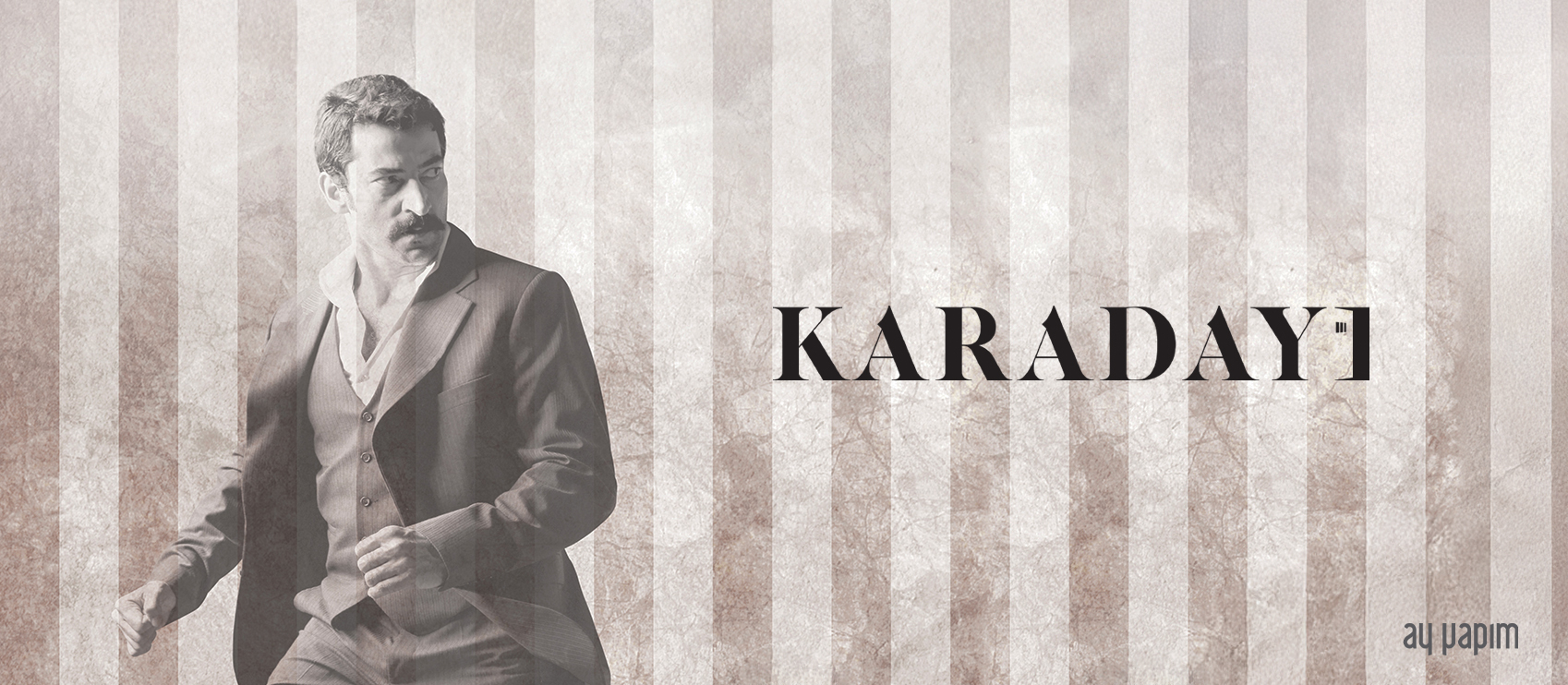
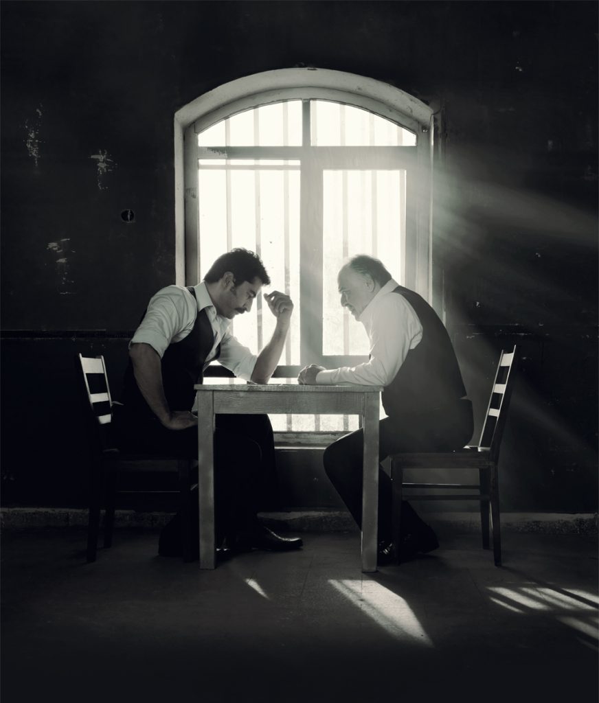
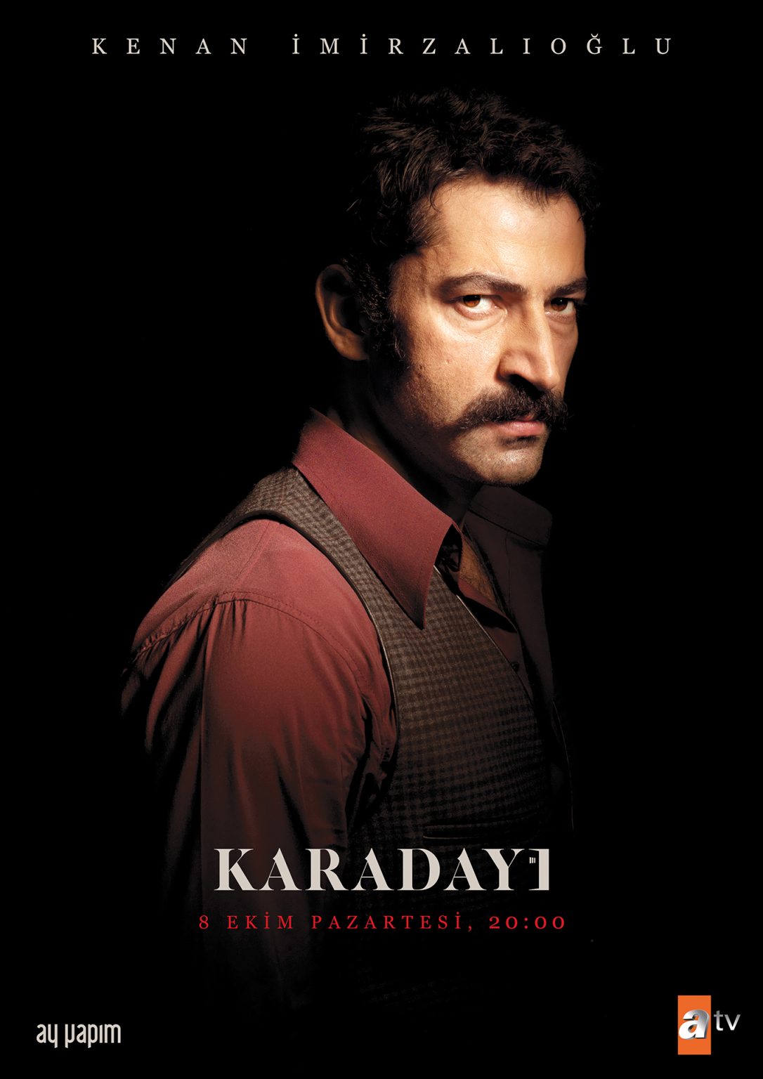
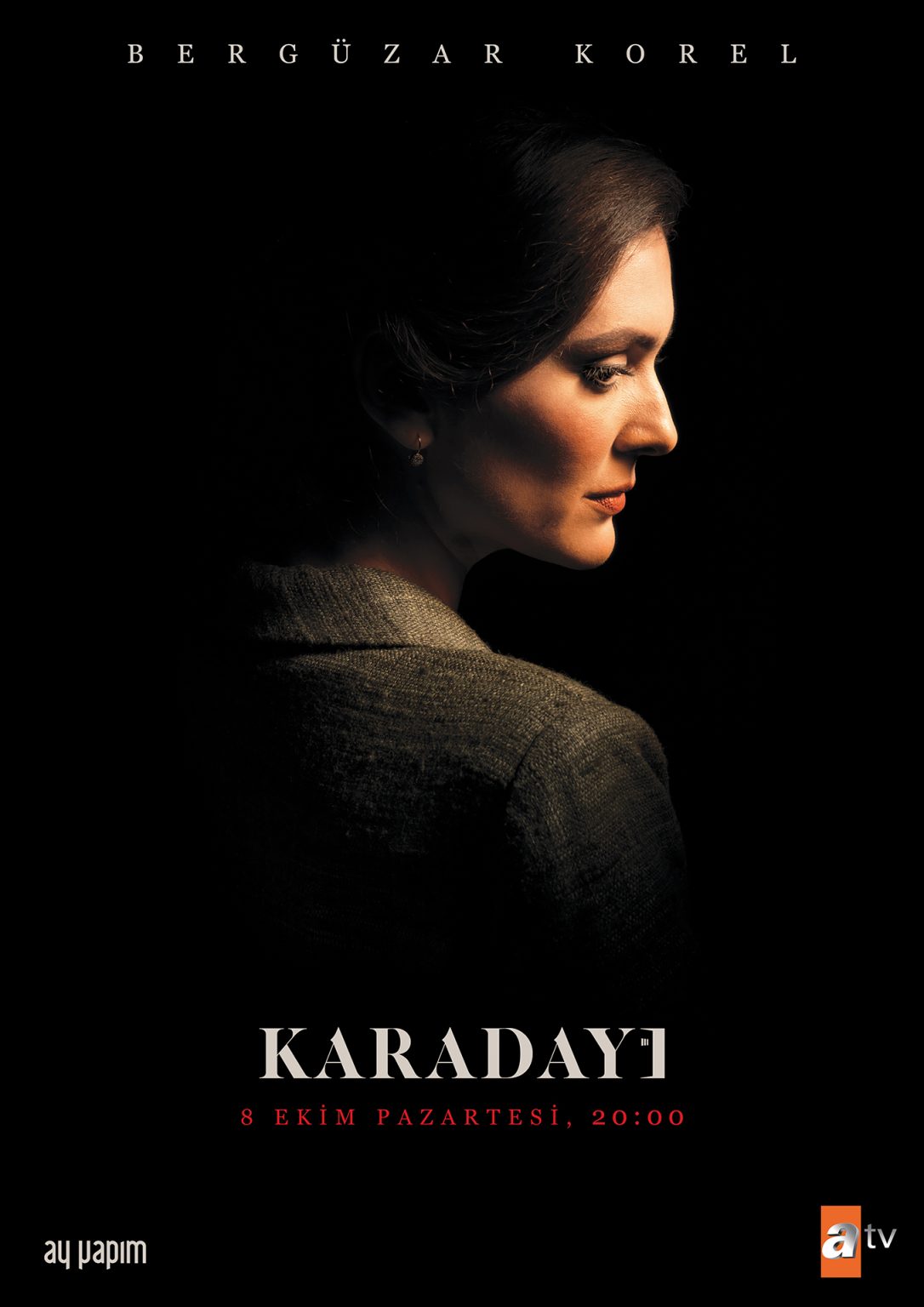
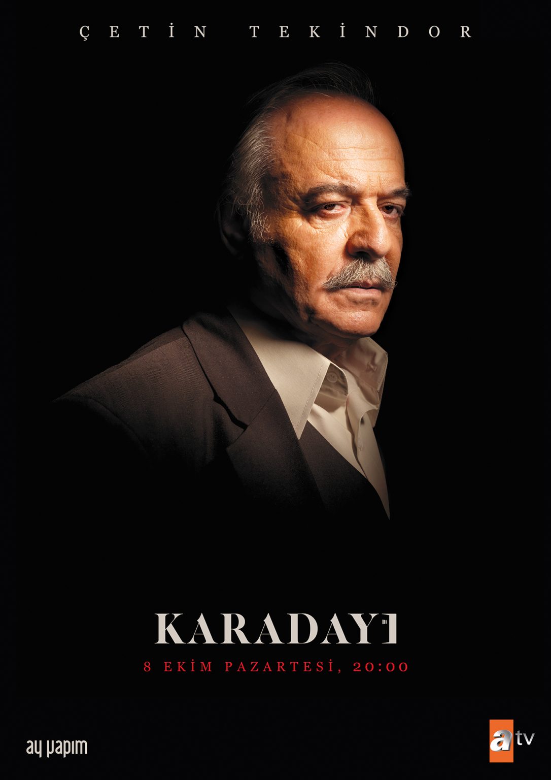
Set in 1970s Istanbul, Karadayı tells a story defined by justice, sacrifice, and impossible love—woven into the texture of a politically charged, emotionally repressed era.

Its central themes—honor, silence, duty, and desire—demanded a visual world that could express deep emotion without saying too much. The challenge was to create a promotional campaign, especially the key art, that would feel true to the restrained emotional weight of the story while visually transporting the viewer into the period’s atmosphere. We needed to find a visual balance that was both timeless and cinematic, while remaining quietly powerful.

Goal

Our approach to the visual direction was rooted in intentional restraint. Every lighting choice, every facial expression, every spatial relationship within the photography had to feel composed yet emotionally charged—subtle but never flat.

We crafted the key art around the narrative’s emotional fulcrum: a man burdened by justice, a woman suspended between duty and forbidden love. The title treatment and campaign elements—across both digital and traditional formats—were designed to preserve the show’s tone and honor its visual rhythm. We embraced stillness as a narrative tool, ensuring the materials echoed the show’s elegance, tension, and understated power.

Result

The campaign succeeded in visually narrating the emotional gravity of Karadayı's first season. Without relying on overt dramatization, the materials conveyed the romantic and moral complexities at the story’s heart.

The key art emerged not just as a promotional piece but as a visual emblem for the series—carried across billboards, streaming platforms, and editorial placements. Its impact helped establish immediate recognition for the show and reinforced its positioning as a premium period drama. The visuals didn’t just reflect the story—they became part of how the audience experienced it.