We shaped a legacy into a modern brand—clear, durable, and built to go global.

Client
VK
Year
2020
Challenge

With nearly 60 years of expertise in producing mattress machinery for some of the world’s leading manufacturers, Veysel Kütüklü was already a respected name in the industry.

But the brand lacked a contemporary, globally recognizable presence. As their business continued to grow internationally, they needed a new identity—one that would simplify communication, reflect their engineering excellence, and establish a clear, confident voice in a competitive market.

Goal

We began by creating a new name—VK, a bold, clean abbreviation designed for global use and instant recall.

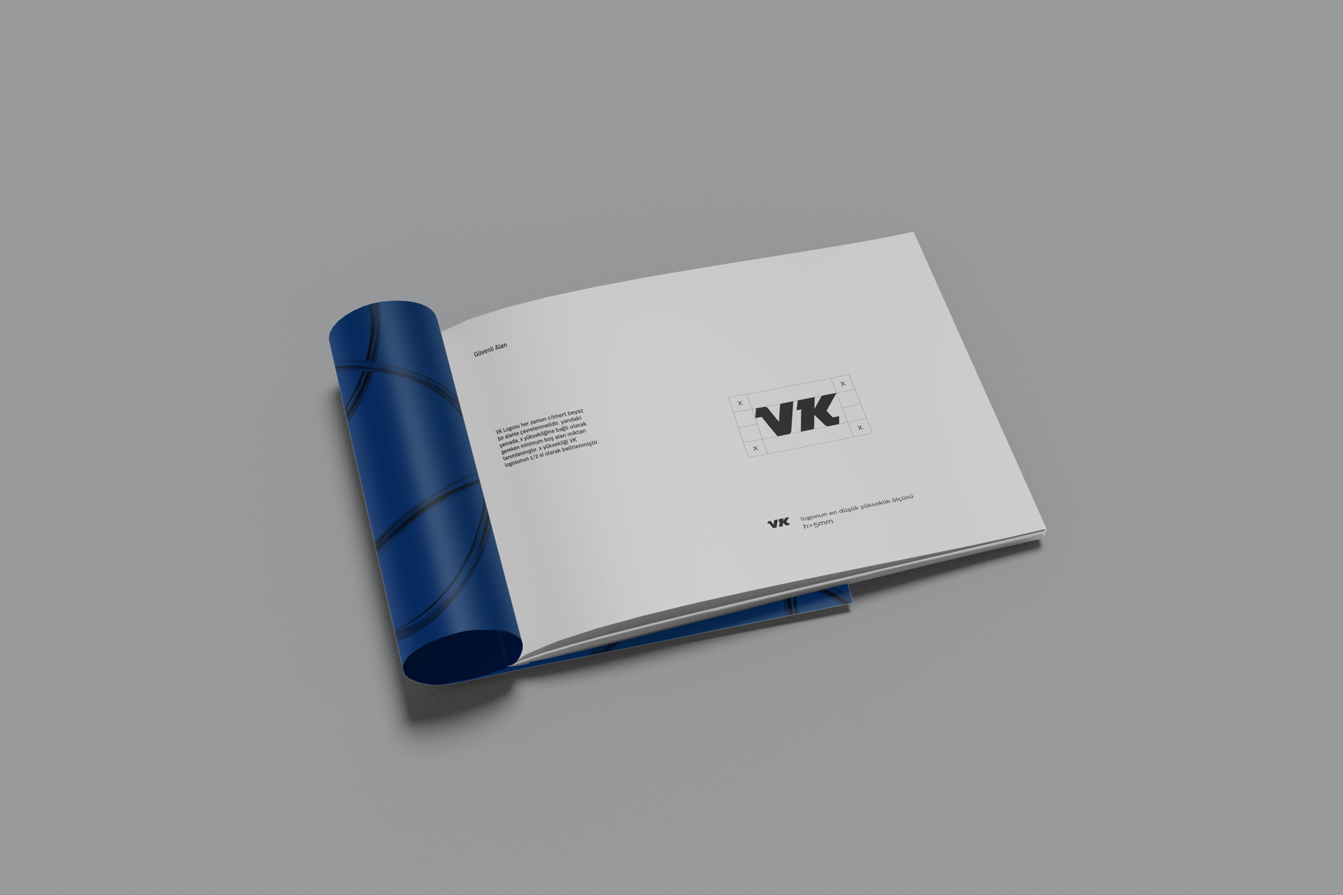
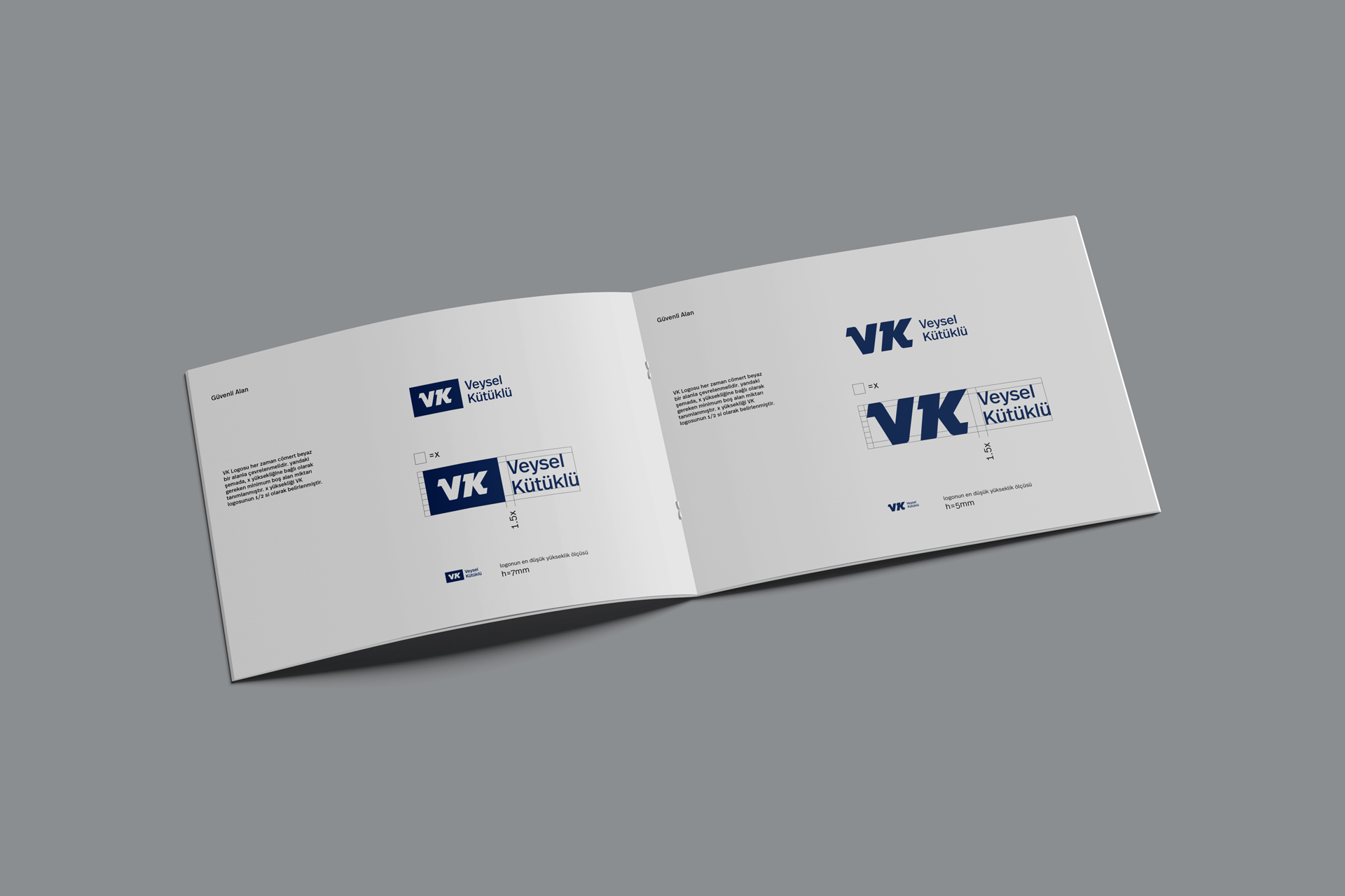
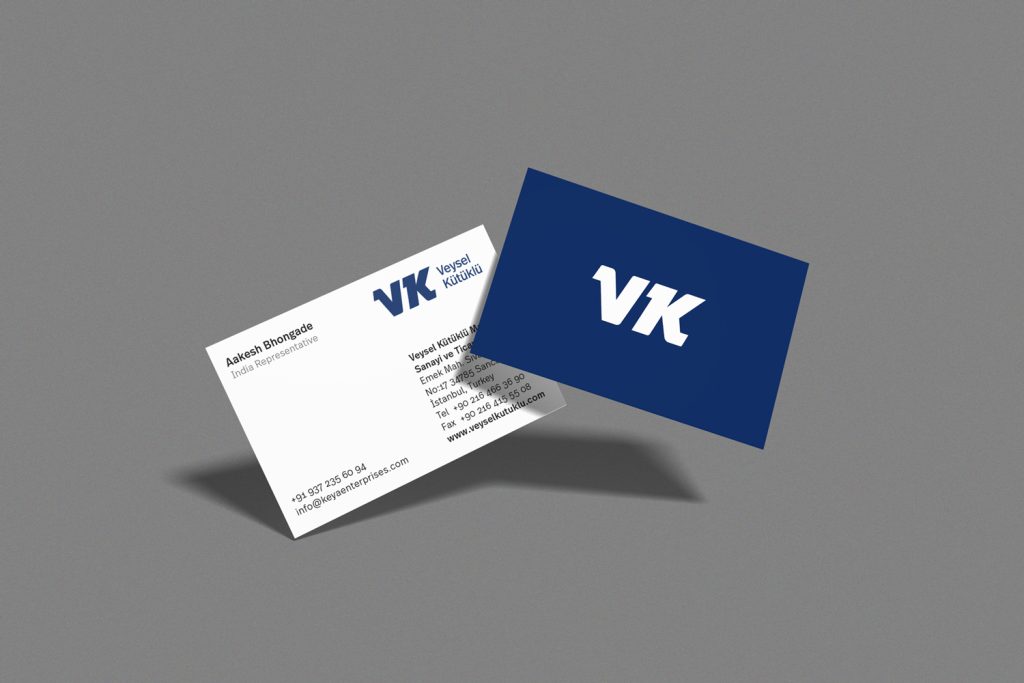
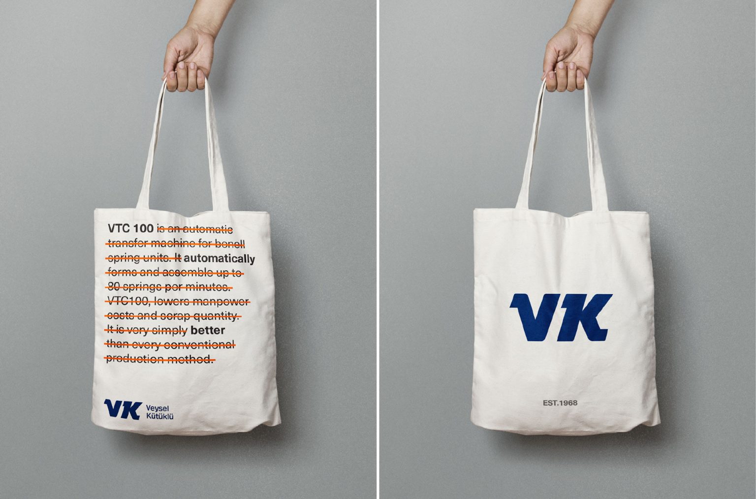
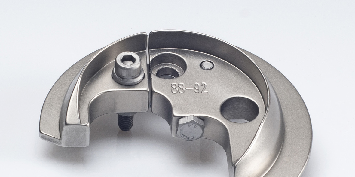
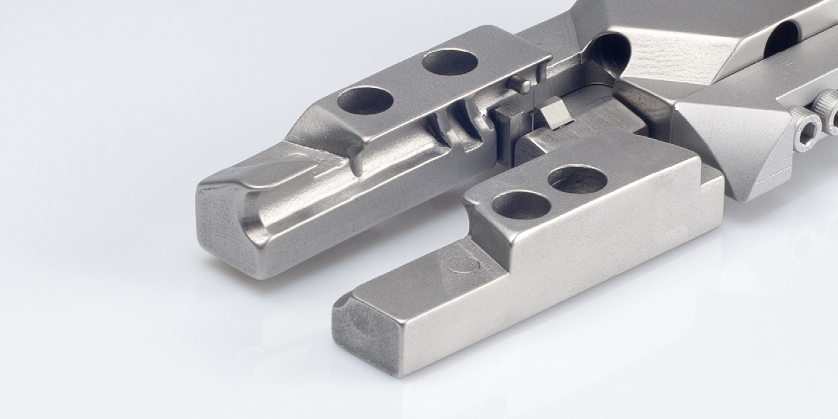
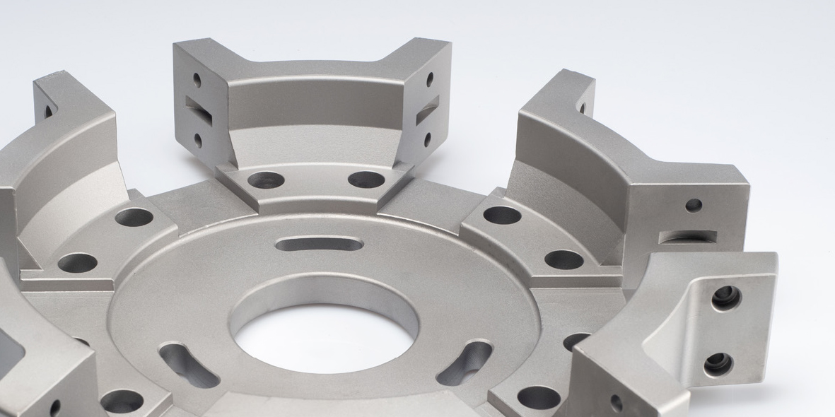
From there, we developed a visual identity system: logo, typography, brand colors, and corporate collateral. We also directed a full reshoot of the machines and their parts, bringing technical precision and polish to the imagery. For international fairs and trade shows, we designed a set of striking, smart campaign visuals that conveyed VK’s core brand message: reliability, performance, and lasting engineering.

Result

The new identity elevated VK’s international presence with a look that feels both rooted and relevant. Across every touchpoint—from trade fair visuals to product photography and digital assets—the brand now communicates with clarity, confidence, and technical sophistication.


This transformation not only improved first impressions but also reinforced trust among long-time partners and new prospects alike. With a visual language as durable as their machines, VK now stands stronger in the global market, equipped with a cohesive and lasting identity that reflects the engineering precision they’ve built their legacy on.