Designing the Bold New Face of Procurement—BigP Summit Branding for Marketing Türkiye

Client
Marketing Türkiye
Year
2016
Challenge

When Marketing Türkiye came to us with the idea of a brand-new summit focused on procurement and supply chain management, we knew it needed more than a conventional look

The goal was to create a standout event with international reach—one that would speak directly to high-level professionals and industry leaders. The summit’s name, “BigP,” hinted at something ambitious. It was our job to give that letter a presence as big as the ideas behind it.

Goal

We began by building a strong visual identity—centered around a striking, architectural “P” symbol designed to evoke strength, forward motion, and clarity.

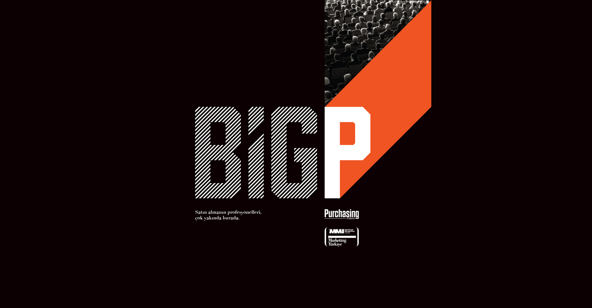
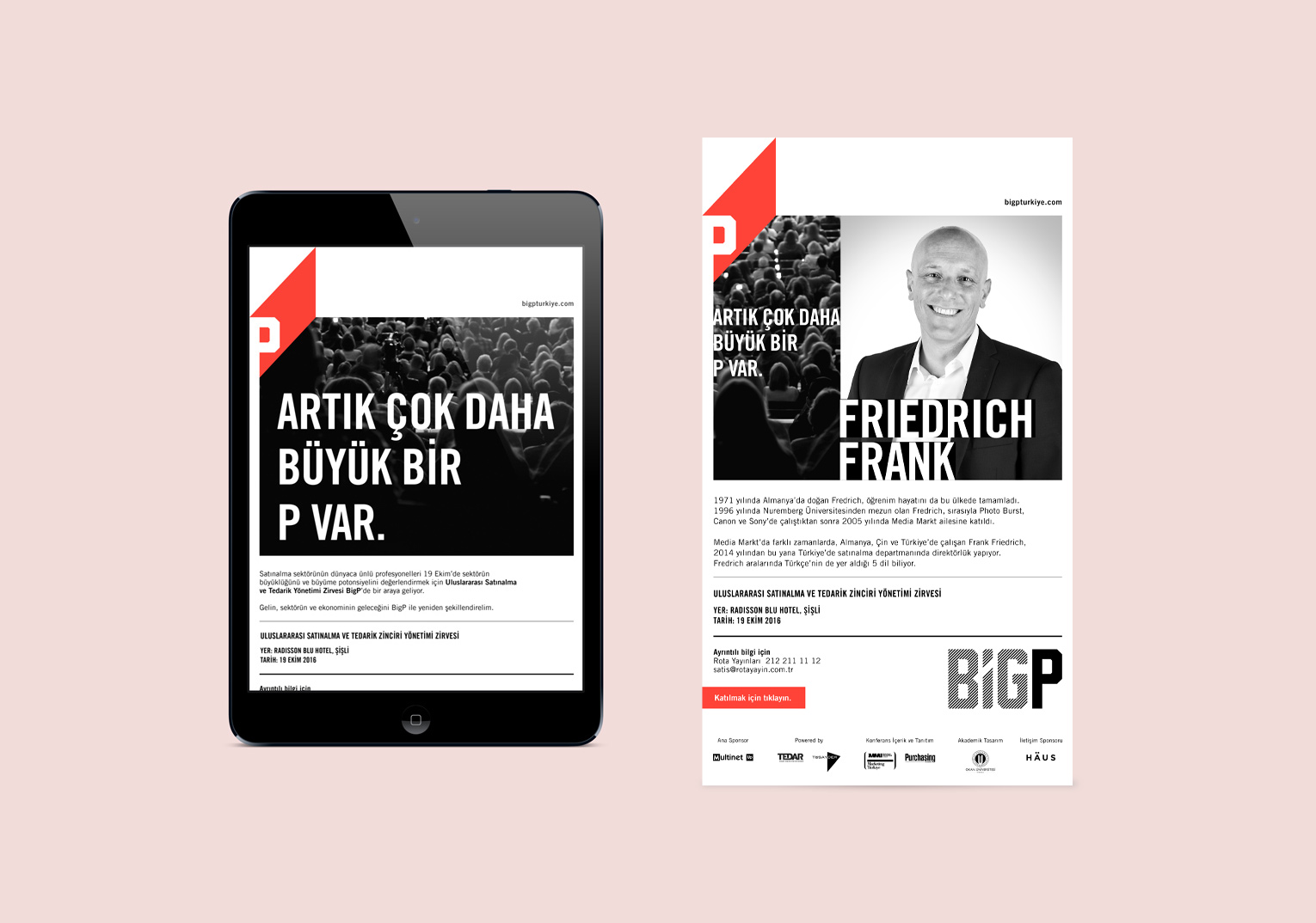
The design system extended across multiple applications: the summit logo, posters, mailings, digital banners, print advertisements, and internal presentation templates. The graphic style was bold but minimal, black-and-white with a punch of red, reflecting the seriousness of the industry while staying visually fresh and modern.


The headline “There’s a bigger P now” served as the creative hook, instantly linking the name of the summit with a shift in mindset—ambition, scale, and transformation.

Result

The BigP identity gave the summit a visual signature that felt confident, fresh, and unmistakably professional.

The campaign brought energy to what is often a sober subject matter and successfully attracted attention across print, digital, and live channels.

We worked to position BigP as a high-impact hub where strategy, innovation, and industry intelligence converge.